A website is basically a marketing tool, representing the companies, products and services it is also a reflection of the companies personality, ideologies and philosophies. It is definitely a heavy burden to carry for a mere website, but it dose. Huge corporations spend millions of dollars to determine the perfect color for the branding and packaging of their product. This is due to the fact that the perfect blend of colors increases the profitability of their product. The same rule applies to the designing of your website.
Color impacts your user on many psychological and physiological levels. Your site's color scheme can have a dramatic impact, either positive or negative on your potential success. Color is an important element of website designing. In Website designing of color is as critical as the design of graphics and layout.
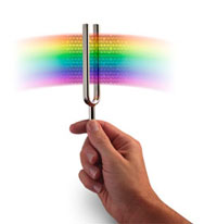
Color and its Effects on Website Designing
Once a visitor has come to your site you have around 8 to 10 seconds to visually appeal to the user and turn them into customers. Since Color affects our feeling, perceptions, and interactions, you can use colors to feel a user feel welcome, comfortable, relaxed, and secure.
Before choosing the colors of your website it is important to get a basic understanding of color and its effects.
Warm colors
Warm colors are based on yellows, oranges, browns, yellow-greens, and orange-reds, colors. Warm colors have a tendency to be aggressive and exciting, so it's best to apply them in small doses.
Intermediary colors
Purples and greens are intermediary colors that are either warm or cool, depending on amount of red or yellow they have in ratio to blue. If the color contains less blue then it is leaning towards a warm hue, and if it has more blue then it is more towards the cool side.
Cool colors
Cool colors are based on blues, greens, pinks, purples, blue-greens, magentas, and blue-reds. Cool colors tend to be soothing, calming colors and can be used in large amounts.
Neutral Colors
Neutral Colors include white, black, gray and colors that contain a large amount of gray. Neutral colors are great for back-grounds and for enhancing the effect of warm colors.
Multi-color
Multi-colored sites have the lowest visitation time, as a combination of warm and cool colors confuses the user. It will often make the site seem cluttered and ambiguous. So it is best to choose a couple of colors and stick to them.
Color Harmony
Too much color can be disturbing and chaotic, whereas too little can be boring. It is best to use a balance. So it's best to Use only a few different colors on a page. Avoid using an excessive amount of colors, blend and use warm and cool colors.
Computer Color Display
Computer monitors display colors using different amounts of red, green, and blue, these are called RGB color. This is an additive form of color, because red, green, and blue light in equal amounts "add" up to white light. All other colors are formed on screen by mixing the amounts of the RGB color. Since RGB color is completely different from the way colors are set in print, it has to be used differently.
Web Color
A common problem on the web is that color often does not reproduce correctly in Websites. The reason is related to bit-depth, a color may be beyond the range of the viewing display setting. Alternative colors may be reproduced, or color shifting may happen. Even if a visitor's system is capable of displaying a color, technical features like hardware age to Gamma control may cause color distortion. Such problems not only cause aesthetic problems but ay also result in visitor retention issues. Given today's technology, color management in the Web can be taxing.
Browser-safe palette
The browser-safe palette of 216 colors gives consistent and conventional results across the Mac OS, UNIX, and Windows platforms. Even though computers today can render millions of colors, you should use browser-safe palette if you think your website will be viewed from a 256 color computer, which can be the general case.
It'll be more effective if you limit the color palette to 2 or 3 major colors with shade variations, as it is visually more appealing. Plus limited colors means smaller file sizes and faster loading.
Text Colors
Be exceptionally careful when setting text and background colors, Readability must be preserved at all costs. If the text is light colored then the background has to be dark and vice a versa. White and black always make a good combination, and red and blue are useful for highlighting. Try to avoid using the combination of black as a back ground with warm color text, as it might be great clarity wise but has a tendency to make visitors nauseous.
Color Chart
When dealing with international visitors, it's easy to get messed up by the meaning of color.
Blue represents peace, tranquility, calm, stability, Harmony, unity, trust, confidence. In China , blue is associated with immortality. In Colombia , blue is associated with soap. In India blue is the color of Krishna in the Middle East blue is a protective color.
Black represents power, sophistication, formality, elegance, anonymity, unhappiness wealth, mystery, fear, evil also. In USA black is for mourning.
Green represents nature, health, good luck, renewal, youth, vigor, spring, generosity, fertility, jealousy. In India green is the color of Islam. In Ireland green has religious significance (Catholic).In some tropical countries green is associated with danger.
Orange represents energy, balance, warmth, enthusiasm, vibrancy, flamboyancy. In Ireland orange has religious significance (Protestant).
Purple represents royalty, spirituality, nobility, ceremony, mystery, transformation, wisdom, enlightenment .
Red represents love, danger, desire, speed, strength, violence, anger, and blood. In China red symbolizes celebration and luck, used in many cultural ceremonies that range from funerals to weddings. In India red is the color of purity (used in wedding outfits).
White represents purity, simplicity, cleanliness, peace, humility, innocence youth, birth, good, and marriage. In Japan , white carnations signify death. In eastern cultures white symbolizes coldness and sterility. In USA it signifies virginity.
Yellow represents joy, happiness, optimism, idealism, imagination, hope, sunshine, and cowardliness. In Asia yellow is sacred, and imperial.
Colors are a powerful tool, it's the first! The first impression of your site, so keep in mind the above points when deciding on the color scheme of your site.